17 Minutes Only!

Monday, 22 August 2016

Top 10 Profile Photo and Portrait Hacks Based on Science

girl with pearl earring - two views
Are you planning to shoot a new profile photo or publicity headshot? Or, are you trying to choose the best image from a group of possible shots? There’s some surprising science to help you plan your shoot and pick a winner.
The best thing about these tips is that their effect is almost always non-conscious. The viewer won’t consciously realize that your photo appears more trustworthy or more attractive because of the content or composition. And, your photographer probably doesn’t know most of them.

1. Profile Photo Lessons from da Vinci

Unless you are obsessive about art and portraiture, you probably never noticed that for centuries artists have preferred to show the left side of their subjects’ faces. 
One compilation of studies showed that for female subjects the bias ran as high as 78%. Male portraits were less skewed, but still showed at least a 56% bias toward the left side.
mona lisa the original profile photo
Scientists at Wake Forest University conducted a series of experiments that showed both conscious and non-conscious preference for images showing the left side of the subject’s face. The left-side preference was true both for verbal statements of preference as well as unconscious pupil dilation.
What’s going on? Our faces and expressions aren’t perfectly symmetrical, and part of the reason is that our right and left brain hemispheres don’t have identical functions. The right hemisphere controls the left side of our body and is also associated more with emotion. The conclusion of most scientists who have looked at the preference for left-side images is that the left side of our faces expresses more emotion.
left-right faces
One reason artists have chosen to portray men from the right side more often than women is that the less emotional right side may perceived as higher in dominance and self-control. Another study looked specifically at drawings by Leonardo da Vinci and found that subjects portrayed by right-side images were considered more “potent” and “active.”
Recommendation. Unless you feel a need to project self-control and power, use an image that emphasizes the left side of your face. It will make you slightly more attractive and, perhaps, approachable.
Study: one side of your face makes you look better. #Neuromarketing pic.twitter.com/6pAgM0X9qr CLICK TO TWEET

2. Keep Your Eye On Your Eyes

Want to be more attractive and trustworthy, at least in your profile photo? An image with larger pupils will do the trick. 
eyes - pupils
Subjects were asked to rate a video image of a person for trust. Unbeknownst to the subjects, the researchers digitally modified the size of the pupils of the person on the screen. Not only did the subjects rate that person as more trustworthy when that person’s pupils were larger, the subjects’ own pupils dilated to match the screen image.
Photo shoot lighting is often working against you from a pupil-size standpoint, as bright lights cause your pupils to shrink. So do pre-flashes for red-eye prevention.
Recommendation. When it comes to pupils, bigger is better. To increase trust, bump up the size of your pupils in your profile photo. Your photographer may be able to reduce the tiny pupil effect with low level modeling lights. Or, do what the scientists did – enlarge the pupils with digital editing tools.
Top 10 ways to hack your profile photo, based on science. #Neuromarketing pic.twitter.com/6pAgM0X9qr CLICK TO TWEET

3. What’s a Limbal Ring?

If you aren’t an opthamalogist or Jeopardy champion, you may not know what the limbal ring is. In fact, it’s the dark edge around the perimeter of your eye’s iris that forms the border with the white surrounding area. Another set of experiments (also described in Eyes Are The Door to Trust. Attractiveness, Too), showed that a thicker limbal ring made people more attractive to viewers of the opposite gender. The scientists postulated that a thicker limbal ring is a marker for youth and health.
limbal ring comparison
Recommendation.While you’ve got Photoshop open to tweak your pupil sizes, consider enhancing your limbal ring. It might make your profile photo bit more attractive. 

4. Can You Say Cheese?

Should you smile for your profile photo? Would a serious expression be better?
Obviously, this decision depends in part on the conscious image you want to portray. A candidate for a senior judicial position probably doesn’t want the photo to catch her in the middle of a huge guffaw. But, science can weigh in here, too.
One study by Brian Knutson looked at how the expression of the person in a photo affected perception of “dominance” and “affiliation.” These are two metrics used by psychologists interested in social organization. Affiliation is a positive characteristic, indicating factors like friendliness, openness, and a need to interact with others.
knutson emotio expression
Smiling images ranked high for both dominance and affiliation. That’s likely the quadrant most of us want to be in when viewed by potential customers, business partners, and so on. Images in which the subject showed anger or disgust also scored high for dominance but were low on affiliation. While such obvious displays of negative emotion aren’t common in headshots or social media images, a very stern/serious image would likely show similar characteristics.
Most of us wouldn’t choose a profile picture showing sadness or fear. Knutson’s work shows why: images with these emotions scored low both on dominance and affiliation.
Recommendation. Include a confident smile in your profile photo. By increasing your dominance and affiliation levels, you will seem like the kind of person others should connect to.

5. Trust Me, I’m Smiling

Smiling profile images are also good for trust. As I described in Unconscious Trust Formed in Milliseconds, a face with smiling mouth and slightly surprised eyebrows was found to be more trustworthy than neutral or scowling faces.
trust and faces
That post also references research on first impressions. While we form them in milliseconds, they can be surprisingly slow to change once formed.
Recommendation. If building trust is your goal, a small smile on your profile photo may be more effective than a big one. And, check your eyebrows. A look of slight surprise will curve them a bit to further maximize trust.
Research: smiling increases attractiveness and trust. #Neuromarketing pic.twitter.com/fsnaCAXBAD CLICK TO TWEET

6. Get Smart

Being seen as smart is usually desirable, and it turns out you can influence your perceived intelligence with your profile picture too. Once again, the answer is smiling. A 2014 study found,
Faces that are perceived as highly intelligent are rather prolonged with a broader distance between the eyes, a larger nose, a slight upturn to the corners of the mouth, and a sharper, pointing, less rounded chin.
small smile means smart
While some of these facial characteristics are out of your control, a small smile is easily achieved. 
One odd finding of this study was that viewers could actually predict the intelligence of male subjects from their photos, while for female subjects there was no correlation between predicted intelligence and actual IQ.
Recommendation. A small smile might make you seem smarter (and, as noted above, more trustworthy), while a bigger smile might boost your dominance and friendliness. Dial your smile up or down depending on the impression you are trying to make.

7. When Guys Shouldn’t Smile

There’s one domain where smiles work for women, but not for men – sexual attraction. One study, amusingly titled Happy Guys Finish Last, had subjects of one gender view photos of the other gender. The photos displayed different emotions. The subjects then rated how attractive the pictured people were. 
While happiness was the most attractive emotion for photos of women being viewed by men, it was one of the least attractive for men being viewed by women. Oddly, perhaps, shame and pride were almost equally attractive male emotions.
emotions and your profile photo
Recommendation. While smiles are almost always a positive for profile photos, men whose interests include dating should tone down the happy smile. Better yet, save the open smile for professional sites like LinkedIn and experiment with less happy imagery on dating sites. Women can smile regardless of their professional or personal objectives.

8. Look at Me!

Have you ever had a photographer tell you to look at something other than the camera? Her hand, perhaps, or a distant object? This may make for an artistic photo, but might not be your best profile picture choice. Scientists in the UK and Australia found that a direct gaze was most attractive.
Viewers preferred photos in which the subject looked directly at the camera and rated those subjects as more attractive. This bias for direct vs. averted gaze photos held both for attractive subjects and less attractive subjects. (I’m imagining an ad in the campus newspaper that said, “Unattractive people needed for psychology experiment. Apply with photo.”)
Gaze direction
The researchers attributed the direct gaze as a social cue indicating a desire to connect with the viewer.
Where should your eyes be looking in your profile photo? Science tells you. CLICK TO TWEET
Recommendation. Unless you’ve got a good reason to be gazing in another direction, look into the camera. You’ll be more attractive, regardless of how gorgeous/handsome you are. Or aren’t.

9. Cocktail Hour Photo Shoot?

This study result may surprise you. Researchers took photographs of subjects under three conditions of alcohol consumption: none at all, a low dose, and a high dose. (To be clear, it was the subjects consuming the alcohol, not the researchers. As far as we know.) The scientists then had other subjects evaluate the photos and rate the individual portrayed for attractiveness. 
Surprisingly, the subjects who consumed a modest amount of alcohol received the highest attractiveness ratings. The high dose alcohol subjects were the least attractive.
alcohol can make you attractive
Why does having a drink make you more attractive? The researchers speculated that the subjects might be slightly more relaxed, or that a facial flush added a bit of robust color to their image.
The right dose is an important factor, obviously, and depends on the weight of the individual. For more discussion, see Want to Be More Attractive? Science Says Have a Drink.
Recommendation. If you don’t have a problem with an occasional adult beverage, consider a “low dose” before your next photo shoot. Don’t overdo it, of course – check the chart below to get your optimal amount, and read my original post for more details.
optimum alcohol chart

10. Don’t be an Idiot

Science gives, and it takes away. Now that you have permission to savor that glass of pinot noir before your next photo shoot, I’m going to give you the negative side of alcohol as it relates to your profile pic. 
Your are likely a fun-loving person who lives life to the fullest. So, why not show that you aren’t 24/7 business by toasting your profile viewers with a nice glass of wine? In fact, you are better off drinking that beverage than using it in a profile photo. 
In my Forbes piece, Proof: Alcohol Makes You (Look) Dumb, I describe a study showed that subjects who viewed identical photos of people with and without alcohol rated the former as lower in intelligence.
wine-coke-none
The authors of the original study termed this phenomenon as the “Imbibing Idiot Bias.” They think that viewers associate alcohol with cognitive impairment. Even in the absence of any impaired behavior or even consumption, the cognitive damage contained in the glass transfers to its hapless holder.
Save the image of you enjoying a margarita in an amazing oceanfront cafe for your Facebook friends. Keep your profile pictures alcohol-free, unless you are a professional sommelier, micro-brewery founder, or have a similar reason to display your adult beverage savvy.

Bonus! 11. Model the Emotion You Want to Generate

We’ve already heard about the advantages of smiling. But, perhaps you want your viewers to experience a particular emotion. Maybe you want to make them angry, as many politicians strive to do with voters. In that case, a photo with that same emotion can have that effect.
angry woman
A study in Sweden exposed subjects to very brief images of face icons with different expressions – happy, neutral, and angry. The images were shown for only 30 milliseconds, too slow to be consciously processed by the subjects. Nevertheless, the facial muscles of the subjects contracted to mimic the emotion they saw.
We know from work by Ekman and others that our facial muscles can change our emotional state to match, so getting a viewer’s face to scrunch in anger will tend to make them more angry than before.
The study also shows the surprising power of non-conscious image processing.
Recommendation. If you are trying to create a particular emotion in your viewers, wear a matching expression in your own photo to invoke the facial mimicry effect.
Top 10 ways to hack your profile photo, based on science. #Neuromarketing pic.twitter.com/6pAgM0X9qr CLICK TO TWEET
Your social profile photo or publicity headshot makes a bigger difference than you might expect. Take the time to optimize the details, and you’ll impress your viewers in the way you want and your business needs.

Wednesday, 17 August 2016

Developing a Conversion Funnel to Increase Sales


If you want a solid marketing campaign that generates positive sales, you should consider using a conversion funnel. This is a tool that is often used by successful internet marketers. By learning how to build a conversion funnel, you’ll be able to create a structured campaign that actually converts.
Here is a simple guide for developing a conversion funnel for your next marketing campaign.
What is a Conversion Funnel?
First off, what is a conversion funnel? It’s a structured outline of your method for acquiring new customers and completing a sale. You’re funnelling your potential customers through a planned campaign, starting with the acquisition and ending with a sale or inquiry.
The reason for the funnel shape is that the number of prospective customers drops off the further along you go. You can then determine where the largest drop-off occurs and come up with solutions for fixing the leak in the funnel.
For example, you may get 1,000 visitors to reach your landing page. Half of those visitors may follow through with the next action, such as subscribing to your email list. Half of those subscribers may follow the link in your next email. The number trickles down until you reach your final conversion rate.
The standard conversion funnel can be broken down as follows:
  • Attraction
  • Interest
  • Desire
  • Action
You first need to attract potential customers. This is done through your standard marketing channels, such as PPC ads, press releases, social media marketing, and search engine optimization. From there, you need to capture their interest, such as with a landing page.
You then use desire in your calls to action to get them to move to the next step – completing an action. The intended action is usually a purchase or contacting you to learn more about your offer.
Attracting the Right Customers
The first part of the funnel is attracting potential customers. You need to attract the right customers to boost your conversion rates and make your funnel more effective. There are multiple solutions for this. You can perform market research to learn more about the interests of your prospective customers.
You could also focus on the copy used in your advertisements and marketing. Use long-tail keywords to narrow the focus of your advertisements. Targeting a niche category within your industry is always a good method for attracting the right customers.
Build Interest and Desire
Building interest and desire gets accomplished through landing pages and emails. Your landing pages should build interest in the solution that you’re providing. Your goal should be to gain subscribers. You can include a call to action on your landing page to complete a sale, but include an opt-in form for subscribing.
Some of your visitors may not be interested in making a purchase right away. But, you could still end up getting their email address. This is an essential part of the funnel. You’ll need to create an email marketing campaign for targeting visitors that left without making a purchase.
Send a Follow Up Email
You can attempt to plug the leak in your funnel by sending follow up emails. The opt-in form that you include on your landing page should be separate from your other subscriber lists. Create a follow-up email that you can send to these visitors.
Your follow-up email should build the desire to come back to your website and complete a purchase. You could include an additional offer, discount, or promotional code to entice the visitor back to your website.
Create an Effective Call to Action
The final part of increasing sales through a conversion funnel is to create a killer call to action. Your call to action needs to convert. If you need help creating an effective call to action, use split testing to fine-tune your final message.
Conversion funnels are incredibly effective at increasing the effectiveness of your marketing campaign. It makes it easier to keep your campaign structured and maximise your conversion rates.
You can easily look at each stage of your conversion funnel – advertisement, landing page, email, and sale, to determine which area needs to be optimised. Focus on the areas where your potential customers start to drop-off and then come up with a solution to plug the leak and improve your funnel.
You can develop your own conversion funnel now or for additional internet marketing tips – click on the following link and learn more about my done-for-you system.

Wednesday, 10 August 2016

Email Marketing Tips: Successful Email Marketing

6 tips to create a winning email marketing strategy 
Email Marketing TipsIf you’re looking for affordable, effective marketing ideas for small business, email should definitely top the list. Email marketing offers some definite advantages that can make it one of the most valuable forms of online marketing that small businesses can pursue. It can be easily personalized to rev up its appeal, is extremely affordable, and gives you the opportunity to market your business directly to your customers without having to wait until they stop by your website or social media pages. Simply sending out emails and hoping for the best isn’t going to get you very far, though. Just like with the rest of your online marketing strategies, there are certain guidelines you should follow to get the best return for your emails.  To help you on your way, here are our top 6 email marketing tips to ensure your email marketing efforts succeed.
Tip #1: Make your emails mobile-ready 
The majority of customers now access their email using a smartphone or other mobile device, and Litmus reports that a whopping 71% of these on-the-go subscribers will delete an email if it isn’t mobile-friendly.  Choose a responsive email design to ensure your emails perform perfectly no matter how they’re accessed – there are a number of free templates available online to show you how.
 Tip #2: Create winning subject linesA killer subject line is the key to successful email marketing. Create interesting subject lines using these tips will help entice recipients to open your emails:
  • Keep it short – 28-39 characters is optimum
  • Make sure your subject lines are directly relevant to the contents of your emails – “bait and switch” tactics are just going to annoy your readers
  • Motivate recipients by including a call to action
  • Create a sense of urgency
  • Include a specific offer or discount
 Tip #3: Provide meaningful calls to action
Crafting meaningful calls to action is the best way to boost the click-through rates on your emails, according to Ascend2’s benchmark email marketing trends report. Make your CTA stand out on your email by using contrasting colors and bold, clear language. Motivate your customers with dynamic CTAs that urge them to directly take action such as “Join the conversation”
 Tip #4: Choose a simple, clear layout
You only have a small window of opportunity to grab your recipients’ attention with email marketing. Don’t overwhelm them with a cluttered layout design that features so many graphics, flashing gifs, and decorative fonts that your message gets lost. Trust in the strength of your message and go with a simple, clean layout with information divided into two or three sections. That will offer just enough visual stimulation to provide interest and capture your readers’ attention without distracting them from your message.
Tip #5: Use short, succinct wording
Don’t make the mistake of overloading recipients with so much text that it puts them off from reading your email. The purpose of your email is to get readers to click through, so present information in a few easy to scan sections that readers can take in at a glance. Positioning CTAs strategically throughout text will entice recipients into taking a desired action to discover more information.
Tip #6: Choose your graphics carefully
It can be tempting to use big, showy graphics to catch readers’ attention, but loading down your email with too many images or ones that are too big can cause your messages to load slowly or appear distorted in email. Some email clients even gray out images, leaving only broken-link symbols. Recipients aren’t going to wait for your email to load; they’re going to trash it unread and move on. Consider sending out emails that are primarily text-based, using contrasting colors and just a few well-chosen images to enhance the message. This approach will help your message to come through clearly and quickly, which can help increase your open and click through rates

Sunday, 7 August 2016

7 Things I Wish I Knew Before I Started Facebook Advertising

Facebook advertising has changed dramatically since it first started.
The massive amounts of data that Facebook collects from its users on their site and across the web allowed them to transform a simple platform to gain likes and a bit of traffic into a robust and complex advertising behemoth that rivals search monster, Google AdWords.
But who cares about the history of Facebook.
If you're around my age, you started using the platform as a teen, and it’s just been a part of your life since then. If you’re older than I am, you probably understood more of the long-term ramifications before I did, and if you’re much older than I am, you’re probably saying ‘What’s this Facebook thing?’
But you’re really here to find out what you can do to spend less on your Facebook advertising.
Here’s a handful of tips I’d give to someone new to Facebook advertising, before they even touched the portal. They are grouped by categories: goals, audiences, and reach, images, in order to answer these questions: why, who, how, and what.

Goals

1. Having the Wrong Expectations

Having the wrong expectations can be deadly. You spend a thousand dollars on advertising, you expect, say, ten leads. What happens if you only get five? What happens if you don’t get any?
I’ve talked about this before - always start with why. Why should anyone care about your brand, what it has to say, and whatever you’re selling? If you can’t answer those questions, go back to the basics, you might not be ready for this.
Your Facebook advertising has to target the right stage of the funnel to be effective.
If you’re aiming for sales, are you marketing to an audience that’s ready to buy?
If they’re not ready to buy yet, consider a different audience, possibly one that is interested in a solution to one of their problems that you’ve already identified.

Audiences

If you do have an audience that is ready to buy, great! Make sure you’re targeting only that audience with ads focused around sales.
This is where the real power of Facebook comes in. They have so much data about you, what you like, what you do on the web, and the power of graph search only magnifies marketers’ ability to create unique audiences and truly reach their buyer personas.
There’s a couple key points:

2. Retargeting

In the same way that Google AdWords allows remarketing to unique individuals that have visited your site, Facebook allows you to target users who have visited yours.
Add the pixel to your site, and it’ll start gathering data for you. This is a great way to target the middle of the funnel. This audience knows about you, but they probably have not converted or bought from you.
Example: While marketing your smartphone app, you set up a retargeting campaign to all website visitors, pushing an offer that addresses smartphone productivity. It’s targeting the right audience, so it performs well, and sets you up for further successes with Custom Audiences.
Use this as an opportunity to build lookalike audiences as well.

3. Lookalike Audiences

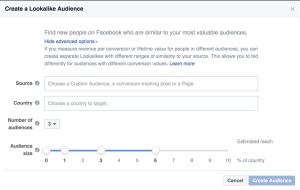
Lookalike audiences are just that - they look like another audience that you have. You can create one from any Custom Audience, which is incredibly powerful.
Facebook will find users with similar likes, similar activity, and other similarities, and you can market directly to users who are like the users in a list that you already have, but aren’t, growing giving you an auto-targeted list.
Keep in mind it’s only as effective as your original list - the more specific, the better.
lookalike audiences
Example: You’ve uploaded a list of users of your smartphone app. You can create a lookalike audience to market to new users, and target them on mobile news feeds and Instagram. Boom! Users.

4. Too broad or too narrow of an audience

This happens all the time. You create an audience that encompasses your target audience. “Great, these people all need what I have,” you say, rubbing your hands together enthusiastically. You set your ads live, and sit back and wait for the results to flood in. Except they never do.
The problem is, your audience never needed what you had. The subset of users in your audience might have, but they were buried in an audience too broad
Example: While marketing your smartphone app, you target an audience of adults from age 18-34 in the United States. Your conversion rate is low, and you don’t get the volume of app installs that you were expecting because this criteria is far too broad.
If your audience is too narrow, the opposite will happen.
Example: While marketing your smartphone app, you target an audience of adults from age 18-34 in the New York, who speak English, have a college education, are interested in Management, and are friends of users using your app. This audience is likely too narrow - you’ll quickly saturate them with ads and your results will spike quickly, then decrease.

Reach

There’s a lot you want to avoid in terms of reach. If you’ve got a solid audience, but aren’t reaching them the right way, the best ads in the world will never convert. Here’s what I’ve learned:

5. Saturating your audience

No matter the size of your audience, they are very likely to see your ad a few times during your campaign - it’s unavoidable.
The trick is making sure that you’re not flooding their news feed with your ads. Monitor your campaigns and try to even them out over time. You don’t want all your results at the beginning, because then you’ll be disappointed for the rest of the campaign.
Example: While marketing your smartphone app, you set up a new campaign with a high budget, with the goal of getting a lot of conversions quickly. You do, but they drop off after the first couple days as the number of impressions rises.

6. Placements

With the purchase of Instagram, and a few tweaks to the Facebook layout, placements (where you ad is located) have changed the way marketers operate. Every placement is going to have different engagement, different goals, and optimal usage.
facebook ad placements
Look at your Google Analytics, and answer these questions:
  • On what device are most of your visitors browsing your site?
  • On what device do most of your visitors land on your site?
  • On what device do most of your visitors convert on your site?
The answers to these will tell you the best placement for your Facebook ads.
Example: While marketing your smartphone app, you leave the default placements on. You’ve created a fantastic ad, are targeting the right audience with a problem to their solution, but the campaign doesn’t do well. You check the placements, and realize that placing ads on desktop will not get you app installs on smartphones. You kick yourself.

7. Not changing your ad design or copy

Ever see the same commercial on TV for a couple weeks in a row?
You likely groan and change the channel. Facebook ads are the same way - your audience will get banner blindness quickly once they’ve seen the same combination of text and images for a few times. Don’t let them reach that point!
Example: You set up a campaign and ad group with one variation. Your impressions are high, but clicks decrease over time, and eventually stop. You’ve saturated your audience with the same ad, over and over, and once again, kick yourself.
Visuals on Facebook are entirely a different beast, but we’ll talk about them next time. Check out these B2B Facebook Ad examples from Bob, in the meantime.
Remember, likes aren’t leads. If you’re using Facebook for business-to-business, you may not see the same results that business-to-consumer advertisers will see.
Also remember, you need to test and iterate. Facebook ads are the same as many things in the marketing bucket, they’ll grow stale over time. Your audience will change as well, so be sure to change with them.

Thursday, 4 August 2016

Product Feed Optimization for Google Shopping

Google-Shopping-Hero-16-9
Most commonly, advertisers starting off with a paid search platform such as AdWords reach their respective audience through keyword targeting. However, with Google Shopping (or product listing ads), e-commerce businesses utilize a product feed as the main targeting tool.
The feed contains information about your products such as price, availability, brand, etc. The better the product feed, the more likely your products will reach a relevant audience with the right search. And the more often your ads reach shoppers looking for your product, the greater your chance of improving not only engagement but conversion rate.
Optimizing your product feed to meet Google’s requirements is step one. But getting the green light in Google Merchant Center does not equate to perfect targeting. There are additional steps you can (and should) take to ensure your product feed accurately represents your products.

First, the basics

Developing your first feed can either be very simple or a big pain. Most common e-commerceplatforms can simply export product feeds that automatically meet Google specifications. This is the best option for most businesses as it makes things easier over time when products change (price, colors, etc.).
Depending on your CMS and product catalog size, it might make sense to manually create a spreadsheet product feed. This is only a viable option for small businesses.
Depending on what you sell, different attributes are required for your feed. Refer to this table for a detailed summary of required attributes for item categories.
As an example, for a non-apparel item such as a phone charger, the following attributes are required in your product feed:
  • ID
  • MPN
  • Title
  • Product description
  • Product type
  • Google product category
  • Product link
  • Image link
  • Condition
  • Availability
  • Price
  • GTIN (if applicable)
  • Brand
If a product has multiple colors, materials, or sizes there are extra attributes required.

How to optimize

The purpose of this post isn’t to help you just meet specifications, though. Google has tons of help articles to help you do that so if you are having trouble, check those out. Also, you can always call the AdWords help number and get help from a rep.
If you are looking to strengthen your product feed targeting, grow reach, and lower cost, there are certain attributes to focus on.
  • Product title
  • Description
  • Product type
Those three attributes are your friends. Google allows you a lot of flexibility with these attributes and it uses them when determining when to show your ads.
Be descriptive! This doesn’t mean keyword stuffing, but it does mean using the language your customers will be searching with. Let’s look at product type as an example.
Product type is similar to Google product category but with fewer restrictions. Your Google product category must match up with Google’s product taxonomy. Say you’re an online sporting goods store. One of your products might be baseball catcher’s gloves. Using Google’s taxonomy, that product is defined as such:
Sporting Goods > Athletics > Baseball and Softball > Baseball and Softball Gloves and Mitts
Google Feed Taxonomy Example
But since ‘product type’ isn’t limited by the taxonomy, you can take that a step further and improve that to:
Sporting Goods > Athletics > Baseball > Baseball Gloves > Catchers glove > Leather Catcher’s Glove > Wilson Leather Catcher’s Glove
You can put in whatever you want to help explain to Google what your products actually are. This will increase the chance of your product showing up when, for instance, someone searches for Wilson catcher’s gloves, and reduce the impressions for more general searches like ‘baseball glove’ because in those cases they’re very likely not looking for that specific product.
This is just one example, but the lesson is to be descriptive. This is your targeting. Don’t assume Google will understand your product with one word when you can use more to tell a better story. Edit any and all attributes you can to tell a better story.

Other recommendations:

Besides building your feed to be stronger, there are a few other things to pay attention to that will help performance:
  • Keep your feed up to date with all product info, availability, and price. Inconsistencies will hurt conversion rates and could result in suspensions from Google.
  • In AdWords, make sure your Shopping campaign is well structured with organized product groupings so you can strategically bid on product groups.
  • Make sure to review your search query reports often to analyze relevancy of traffic and add negative keywords when necessary to improve targeting.
Optimizing Google Shopping campaigns can be a little counter-intuitive if you are more used to traditional search advertising. But that doesn’t mean you don’t have tools to improve performance. You just need to take the time and work with your CMS or manual feed. If you have additional questions about where to start, let us know!